New Bitiba
Web app | Feb 2025 - Jun 2025Bitiba was relaunching as a leaner, price-first pet supply platform. I joined mid-development as the design lead — tasked with tightening the MVP before launch and shaping a new membership concept from scratch. That meant identifying usability gaps in a live build, researching loyalty models, and taking a membership concept from early research to tested prototype in four months.
Problem & Goals
There was no single design brief at kickoff. Through stakeholder conversations and early analysis, I shaped the scope around three core objectives:
- Make the platform's price advantage visible and credible.
- Introduce a lean membership model to drive registrations and build long-term loyalty.
- Streamline operations via centralized catalog improvements.
The design challenge was simpler to state than to solve: make the value obvious, the sign-up frictionless, and the experience trustworthy.
Understand
Competitor Analysis
Journey Mapping
Competitor Analysis
To understand the landscape of lean loyalty programs in e-commerce, I explored several competitors across Europe. The goal was to analyze how they position their programs, communicate benefits, and integrate the membership concept within the shop.
I evaluated aspects such as access tiers, pricing visibility, design presentation, and overall user experience to gather inspiration and identify areas for differentiation.
Main Findings
- Concept: Memberships are designed to deliver benefits that attract users and encourage long-term retention.
- Key benefits: Most competitors clearly highlight benefits upfront, ensuring users fully understand the value they're signing up for.
- Narrative: Consistent messaging and a recognizable identity are maintained across all screens and channels, ensuring a cohesive and unique experience.

Journey Mapping
To align the team around a shared understanding of the customer experience, I mapped out a simplified journey that reflected a realistic user flow through the platform. This helped identify potential integration points for the membership offer.
The journey map became the base for a lightweight ideation session, where I gathered quick feedback from stakeholders and team members. This collaborative approach helped surface new ideas and considerations that shaped the direction of the solution.
Opportunities
- Value messaging: Highlight savings and perks clearly. Help users immediately see the benefits of joining.
- Streamlined registration: Simplify the sign-up process. Integrate registration seamlessly into the shopping journey.
- Post-purchase engagement: Reinforce membership value after purchase. Remind users of benefits to build long-term loyalty.

Define
Design Direction
Explorations
Design Direction
The design aimed to simplify entry into the membership program while creating moments of clarity and reinforcement. We prioritized early communication of value, reduced friction in registration, and designed subtle reminders that reinforce the benefits after purchase.
Due to tight timelines and the live nature of the platform, I moved into high-fidelity design early in the process, balancing stakeholder needs and ongoing development constraints.
Explorations
During the early exploration phase, I explored a more ambitious vision for the membership, experimenting with custom branding, naming, and a separate color palette to differentiate it from the core shop. However, due to stakeholder priorities and time constraints, we scaled the concept back to focus solely on its core value: access to discounted prices.
While we challenged this decision at several points to explore a deeper offering, the team ultimately agreed to keep the MVP lean and ship early. The foundation was designed to be expandable for future iterations.


Design
UI Design
UI Design
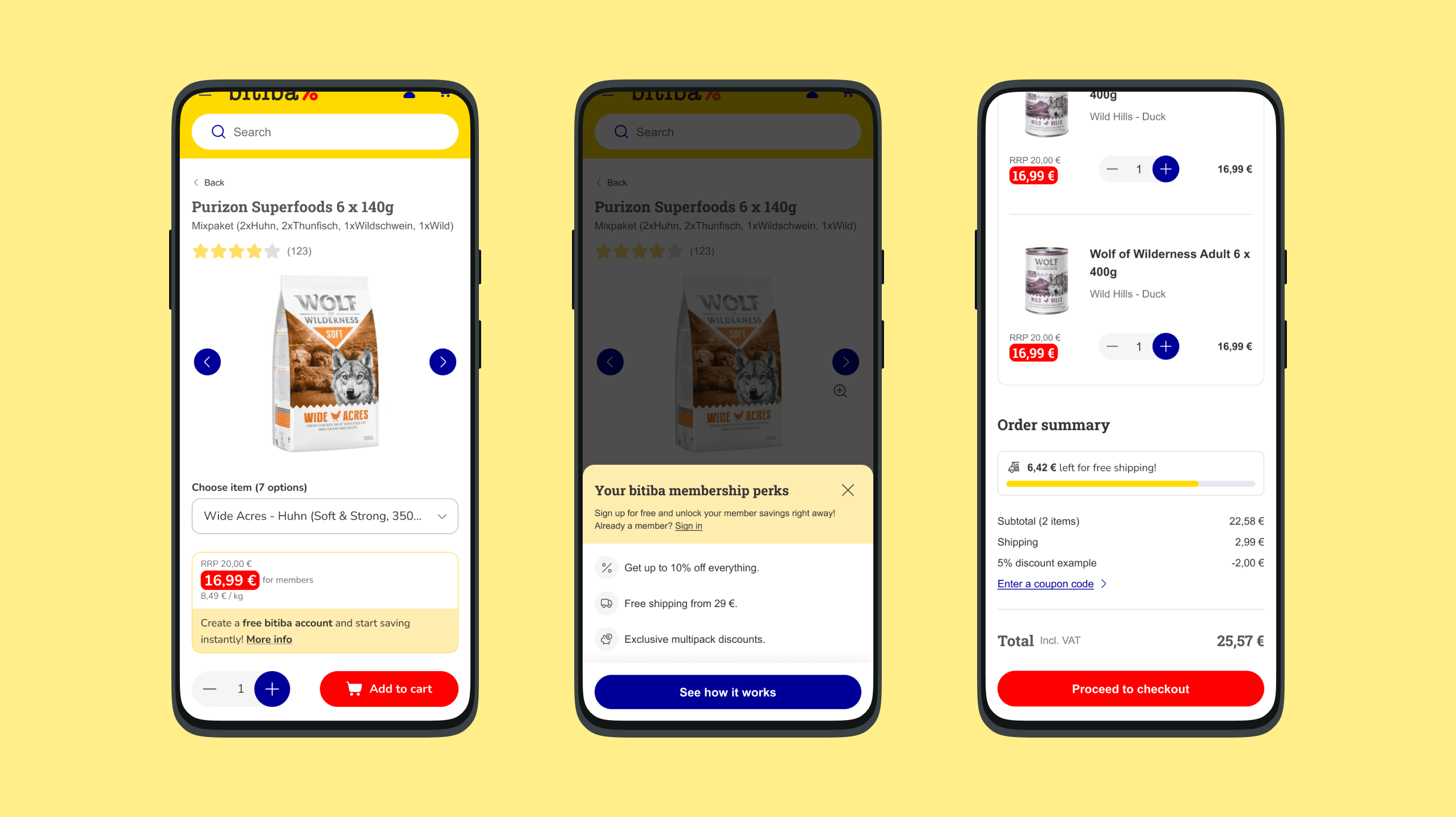
The final screens reflect the decisions made upstream — clarity at every touchpoint, from product pages to checkout. Price visibility and membership messaging were the hardest problems to solve: the savings had to be obvious without feeling pushy, and the hierarchy had to work for both members and non-members at the same time.


Testing
User Testing
User Testing
I conducted moderated usability testing with a mix of 5 internal employees and 5 potential users to evaluate the redesigned membership experience. The focus was on clarity of value, ease of registration, and overall usability across key touchpoints. Each session included both the current implementation and the new prototype — tested from the product detail page (PDP) through to purchase.
- Most participants preferred the new version, valuing the clarity around savings and early visibility of benefits.
- Some users were confused about the membership process, highlighting opportunities to improve messaging and onboarding.
- Checkout improvements — such as simplified address entry and better visual guidance — were appreciated, though some users missed the option to check out as a guest.
Feedback led to refinements in copy, layout, and user flow — particularly how savings were framed and how the membership process was explained.
See prototypeTakeaways
A live platform, tight timelines, and stakeholders with strong opinions on scope. The constraints were real — and they made the work sharper. Journey mapping aligned the team early; competitive research clarified direction; moderated testing confirmed what worked and surfaced what didn't — especially around savings messaging and onboarding clarity.
If I had more time, I'd explore stronger post-purchase engagement, run A/B tests, and bring in more behavioral data to track performance over time.