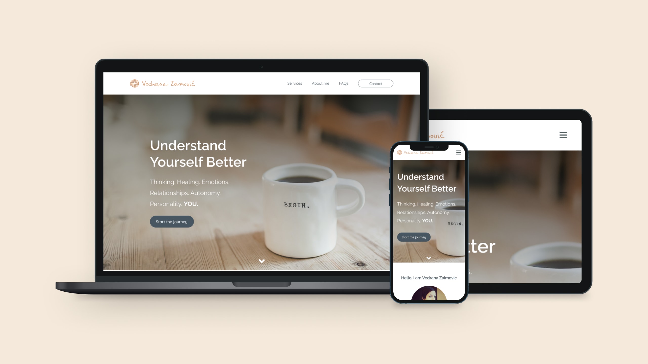
Vedrana Zaimović
Website Design & Development | Designed 2020 · Built 2025–26Vedrana is a psychologist in Munich. She's also my partner, which is how a site for her practice became my project twice: once in 2020, as the final piece of a design course, and again five years later, when she started going freelance and the old files came out of the drawer. I designed it, then built it, with a long enough gap in between to disagree with myself.
The brief
Earn trust quickly, say what she does without jargon, and make it easy for someone in a difficult moment to send a first message. Someone looking for a therapist isn't browsing. They're deciding, in about ten seconds, whether this feels like a place they could speak honestly.
The feeling
Warmth as a requirement
The palette
Warmth as a requirement
The mood board came before any layout. Warmth wasn't decoration here. It was the first functional requirement. The work itself is difficult, and it depends on the person feeling able to open up. A site that reads cold loses them before the first sentence.
That ruled out most of what therapy websites reach for: clinical blues, stock photography of serene people on sofas, the soft-gradient wellness-app look. I wanted something closer to a living room than a waiting room, done in creams, terracotta, and sage. Warm enough to sit down in, quiet enough not to perform. Sage came half from Vedrana; green is her colour and she has a better eye for interiors than she'd claim.
The word BEGIN was on a coffee cup in one of the images. Nothing planned about it, but it stayed: you don't have to be ready for all of it, only to start somewhere.
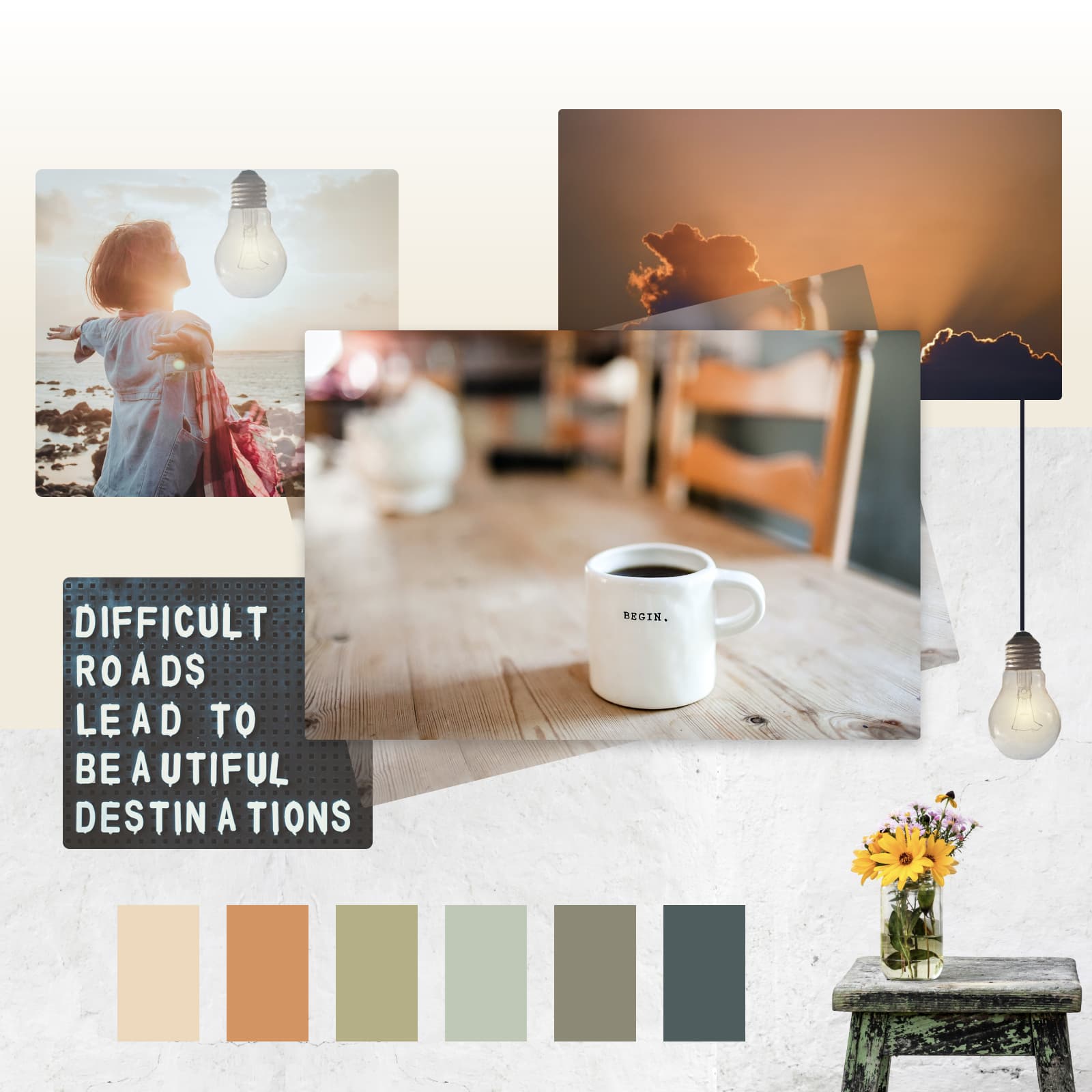
The finished site came out considerably more minimal than the board. That's the board doing its job, setting a temperature rather than a specification. Most of the texture fell away and the warmth stayed.
The palette
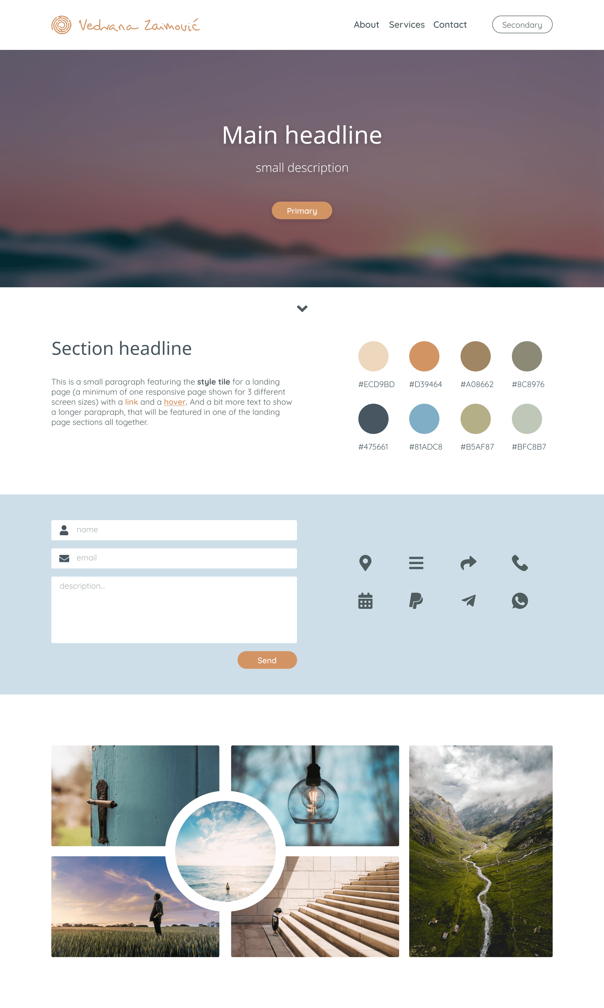
The style tile fixed the language: colour, type, form elements, spacing. The primary is #475661, a slate blue warm enough to sit with the terracotta and dark enough to be trusted with body text. It went into the SCSS variables file five years later without a single adjustment.
The typography on this tile did not survive. More on that further down.
The mark
What it wasn't
A labyrinth, spiralled
What it wasn't
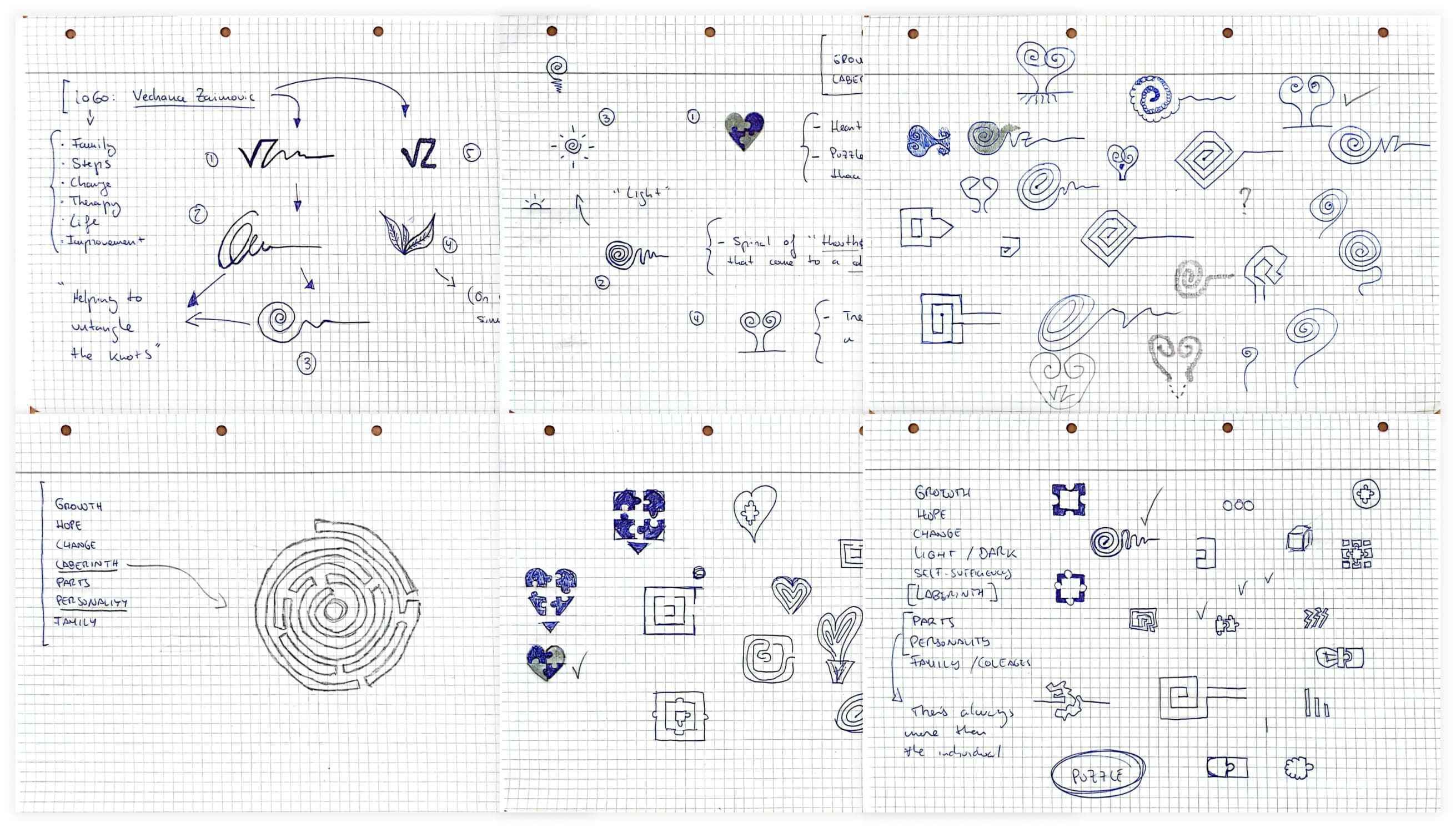
The obvious directions came first and went first. A heart, a tree, botanical forms. All of them are already on the door of every practice in the city. The puzzle piece I disliked for a different reason: it implies a person is a thing with a bit missing, waiting to be completed. That's not what happens in the room.
I rejected the labyrinth early too, then came back to it.
A labyrinth, spiralled
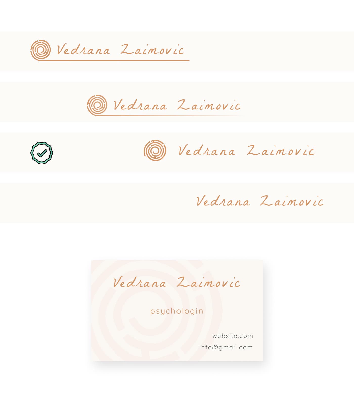
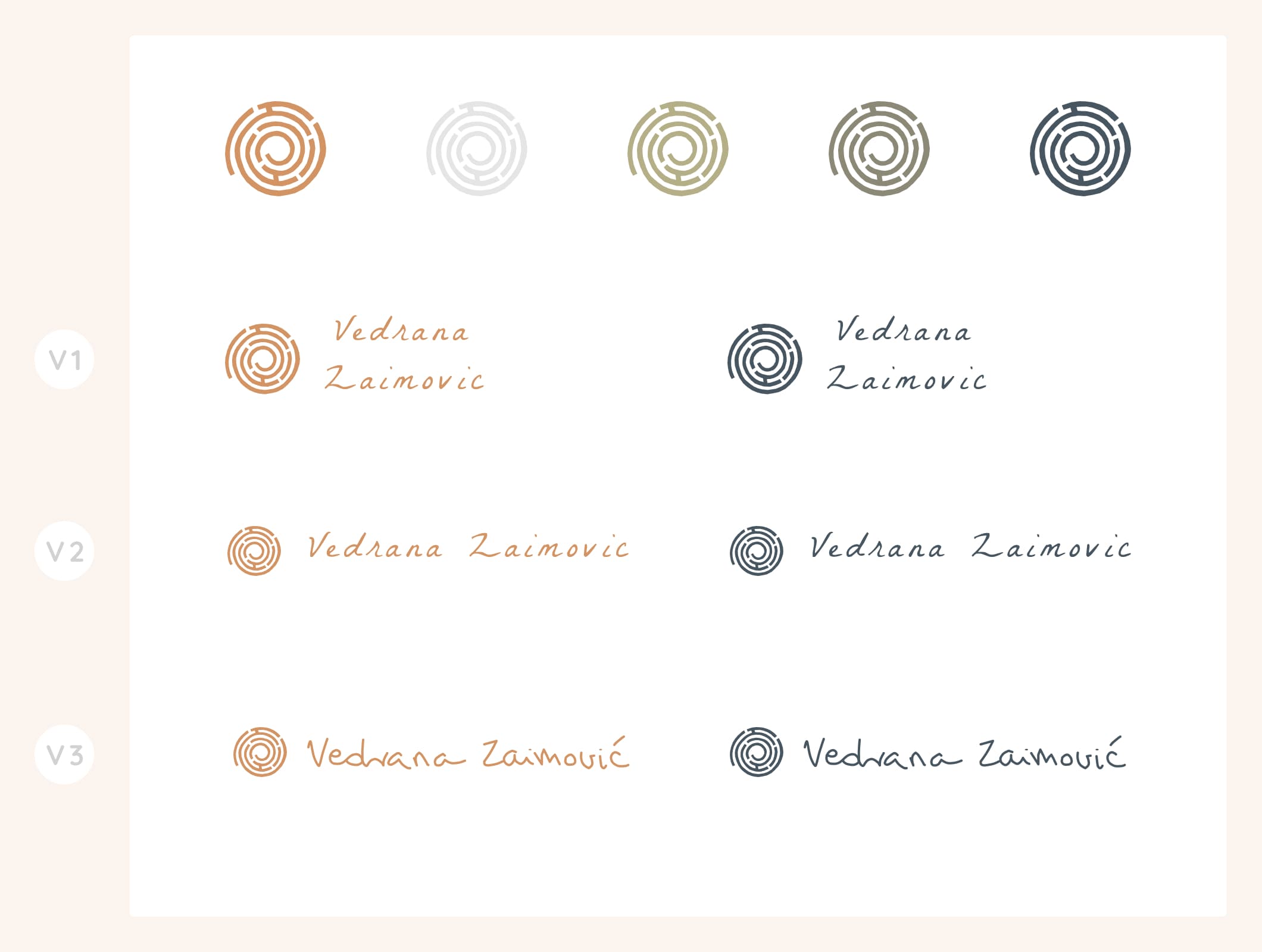
The final mark is a labyrinth drawn as a spiral. Therapy doesn't end with being healed — you keep the same history, the same wounds; what changes is how you carry them and how well you see them. A spiral says that in a way a circle can't (closed, finished) and a wave can't (too smooth, no walls). You go round, you hit something, you go back, you take another way in.
The direction it winds wasn't a decision. I'd like to tell you it was.
The wordmark isn't a typeface. It's her signature, vectorised from her own handwriting, close enough to what she'd write at the bottom of a letter. A set typeface would have been cleaner and would have said the wrong thing. The work she does is done by hand, one person at a time, and the name on the door should look like it was put there by a person rather than set by a machine.
The decisions
The order
Warmth before credentials
Pricing in the open
The order
The nav holds four items: About, Services, FAQs and Contact. FAQs and the contact form live as sections of the homepage rather than pages of their own. The content was too much for one long scroll and too little to justify real navigation.
FAQs on the homepage was deliberate. People arrive with the same unspoken questions: what it costs, which language, what actually happens in a first session. Making them hunt for those answers adds friction exactly where you can least afford it. Answering early also means the first real conversation doesn't start from zero.
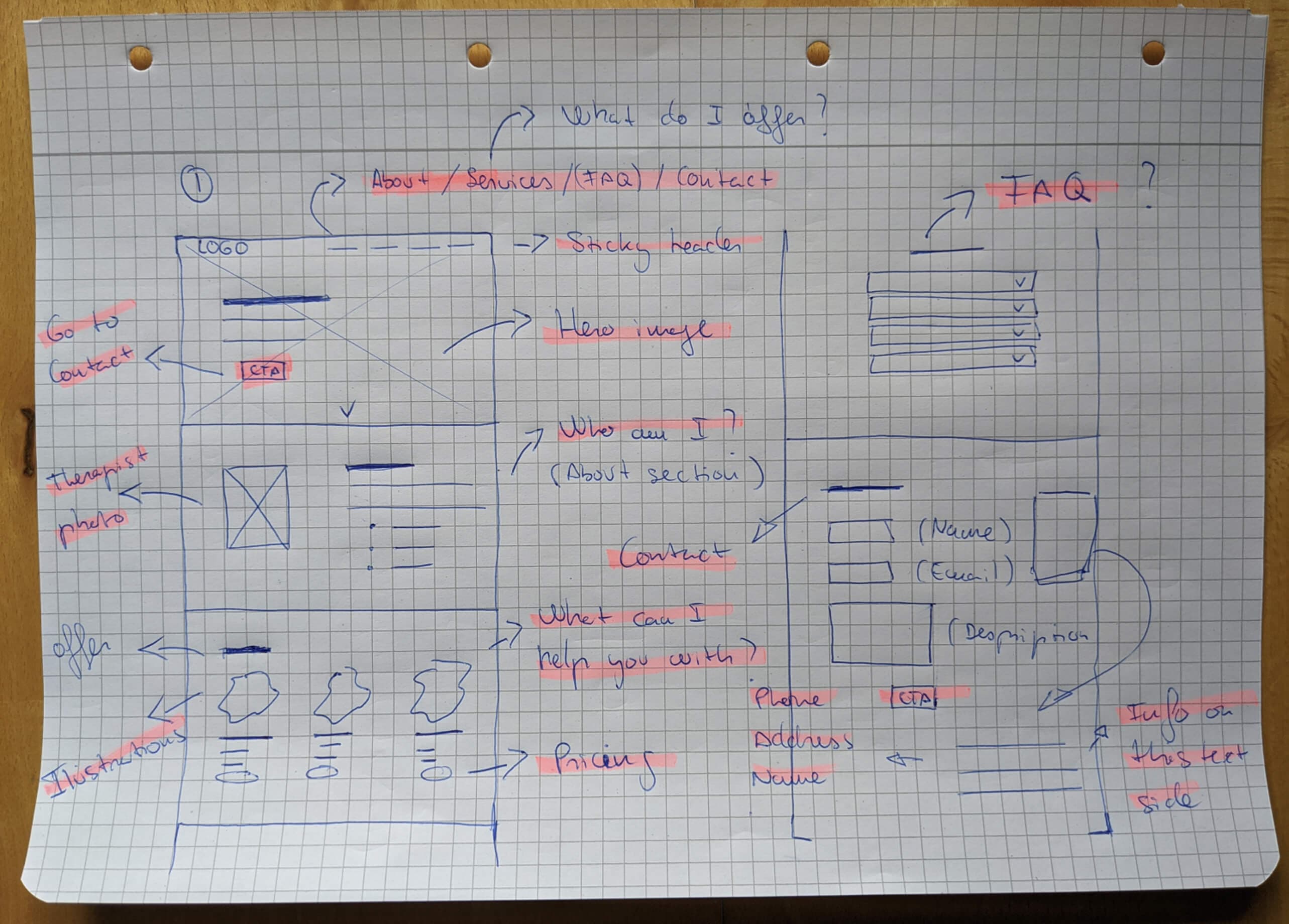
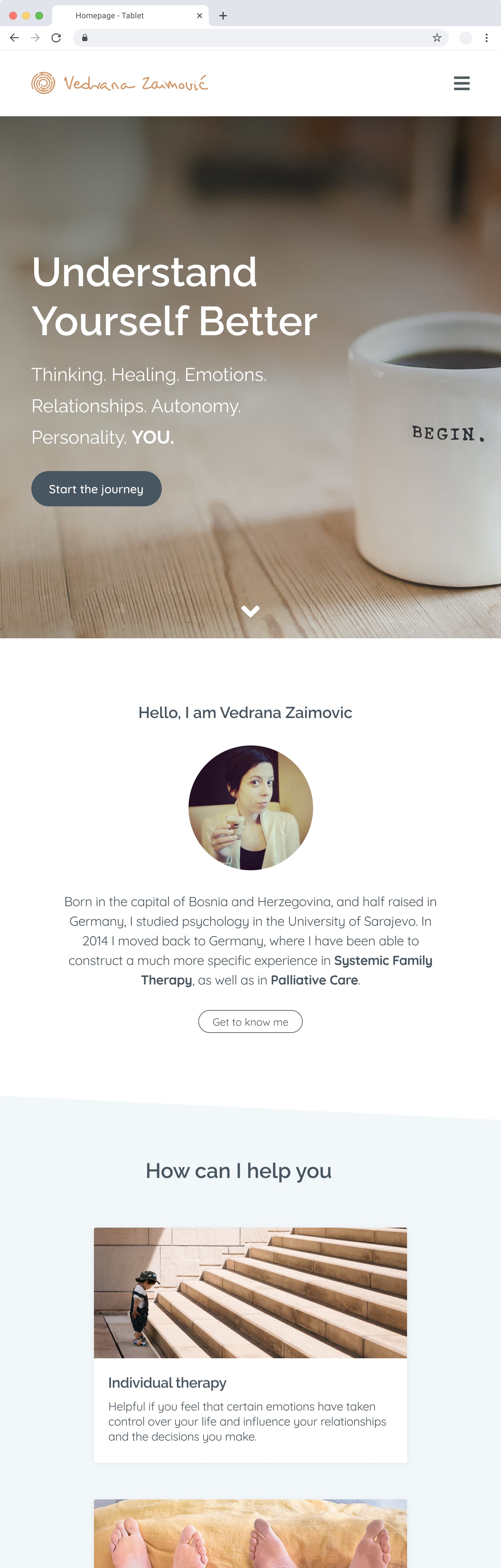
The order was the point. Looking back at the sketch, I'd written the sections out as questions rather than labels, things like Who am I? What can I help you with? That's the sequence someone actually moves through: see her, work out who she is, find out what she offers, get the practical answers, then decide whether to write. Hero, about, services, FAQs, contact. It shipped in that order.
Warmth before credentials
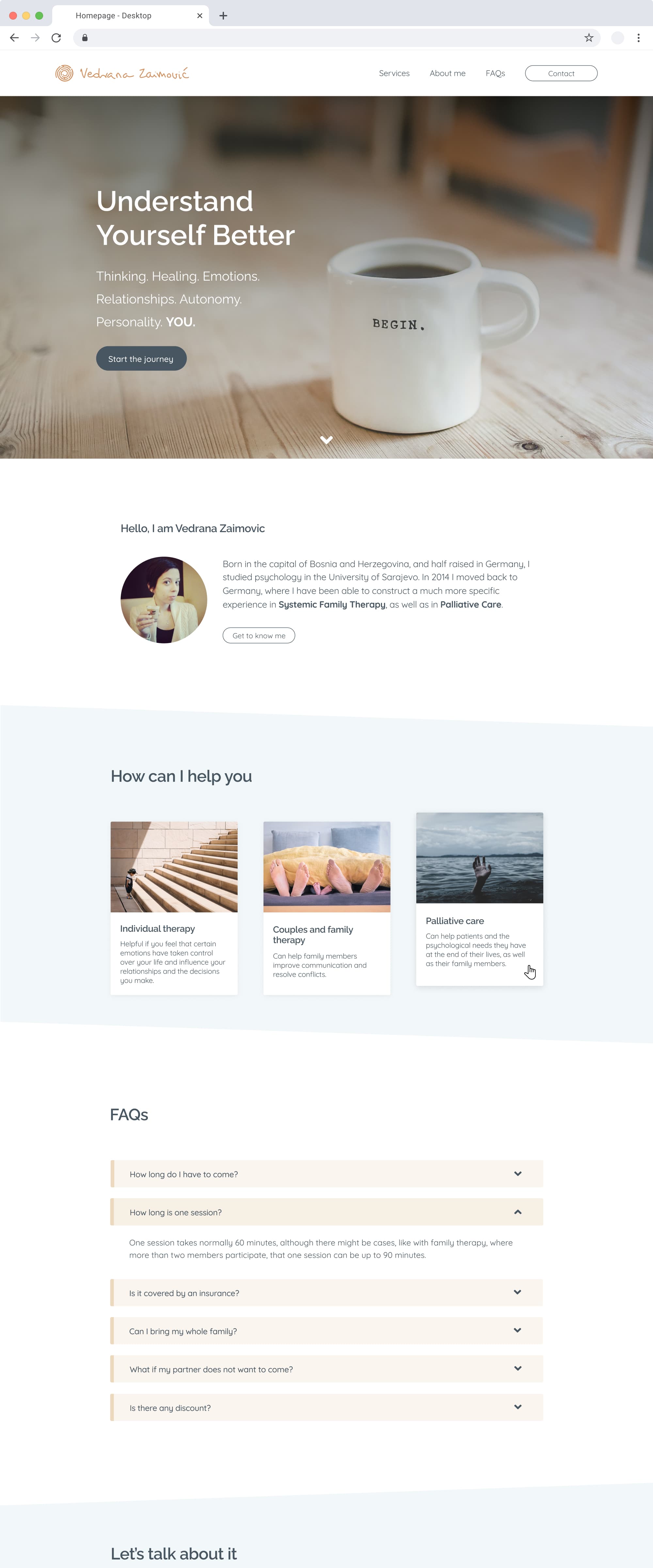
The hero opens with how it feels to work with her, not with her qualifications. The first question isn't whether she's credentialled, it's whether this is someone you could say the difficult thing to. The 2020 version pushed that too far: it set a mood without ever plainly saying who she was. Live, she introduces herself. Warmth still comes first, it just stopped being coy. The mug from the mood board made it all the way through and became the photograph.
The three services survived almost intact. What changed was the shape. The original boxes and buttons were too square to read as anything but a form, and rounding them moved the whole page a few degrees warmer. The cards stay short on purpose; the detail, the quotes she chose, and the pricing live on the Services page, designed later and straight in code.

Pricing in the open
Fees sit on the Services page, stated plainly, next to the thing they're paying for. Pricing on request reads as something to be negotiated, and that's the wrong posture for someone already unsure whether they can afford help at all.
Underneath them is the line that does the most work on the whole site:
“My fees are adapted to different income levels. A limited number of sliding scale places are available for individuals with reduced financial resources. I am happy to discuss this after an initial consultation — please feel free to get in touch.”
Her words. It tells you more about how she practises than any amount of warm colour.
Five years later
What I changed
The build
Live
What I changed
The files sat untouched from September 2020 until October 2025. In between I spent three years as a product designer, then went back to engineering. I opened them with different eyes.
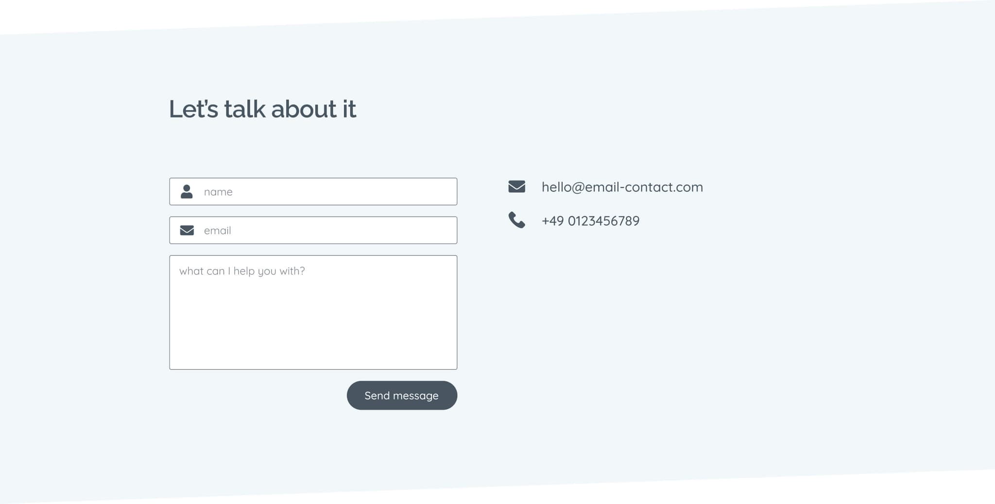
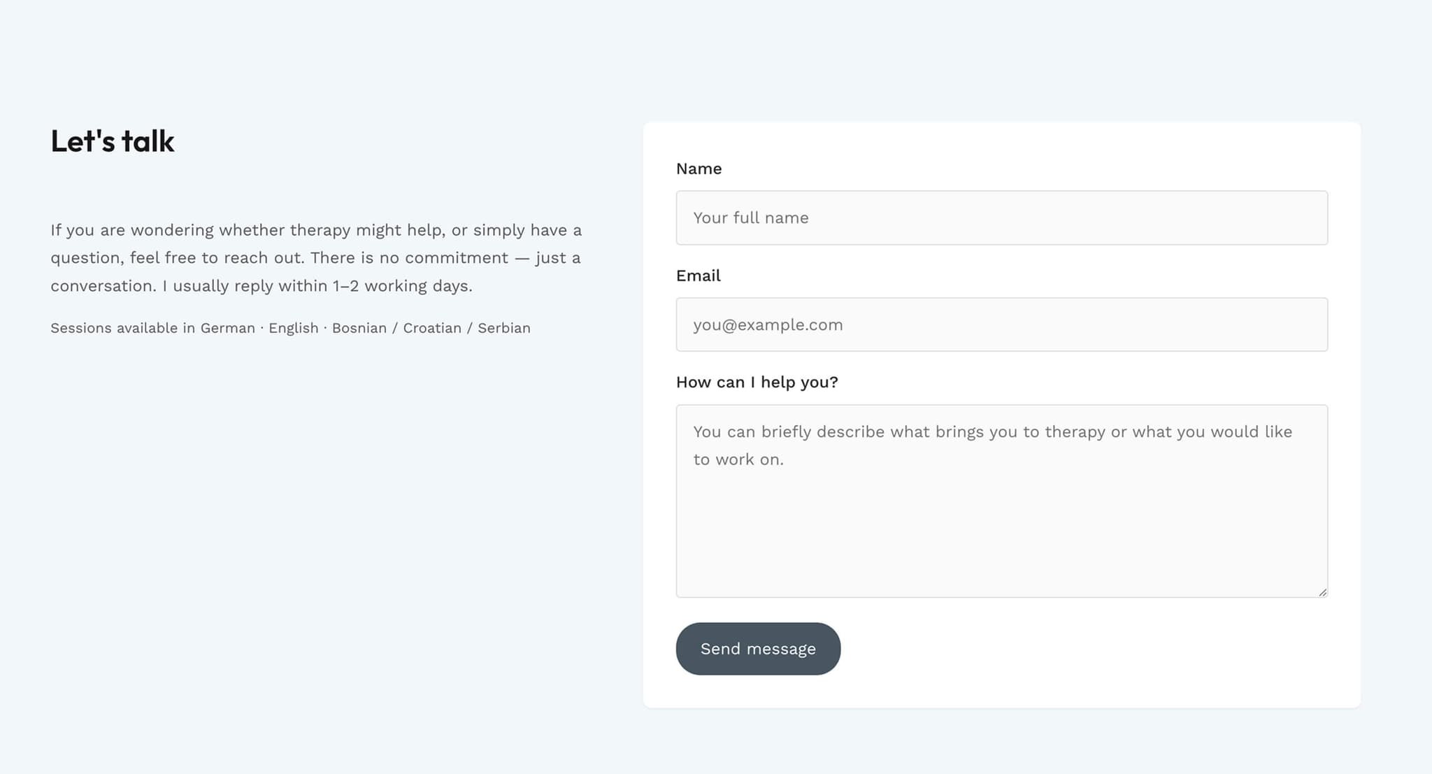
Roughly 80% held. The typography didn't: Raleway and Quicksand became Outfit and Work Sans. The originals were friendly the way a poster is friendly, not wrong, just not carrying enough weight for someone's practice. The contact form went too. The 2020 version looked dated and awkward to use, which is a poor combination for the one element the entire site exists to serve.
The palette, the structure and the mark survived. Five years is a harsh review, and it's rare to get to run it on your own work. The contact form below is the clearest case, the 2020 design first, then what shipped.
The build
Next.js 16 with the App Router, TypeScript, SCSS Modules, deployed on Vercel. Email through Resend with a honeypot field for spam.
No CMS. The copy on a practice site barely moves once the words are settled, and she's not going to log into a dashboard to change a paragraph. If a blog happens later, that's when one starts to make sense. Colour tokens live in an SCSS variables file, about seventy lines, which felt like enough structure for a site this size.
Resend rather than rolling my own: I tried that first and it was slower and worse than paying a few euros for something that already works. Formspree runs my own site fine, it just felt a bit dated for this one.
I started by hand on purpose. I'd just moved back into a frontend role and wanted the practice. Then a deadline showed up and I switched to Claude Code, which carried most of the implementation from there. I read every change and kept the last word, but I'm not going to pretend I typed it all. Most of the job now is spotting when the answer's wrong.
Live
Lighthouse on desktop: 96 performance, 93 accessibility, 100 best practices, 100 SEO. Mobile performance drops to 67, which is the honest number and the next thing on the list.
Accessibility is where I'd push back on myself hardest. 93 is a decent score, but I inherited it from framework defaults and one automated pass, not from thinking about it. For a site whose entire audience is people in some form of distress (reading on a phone, late, not at their best), that deserved deliberate attention and didn't get it. Translations are outstanding too; she wants it in more than one language.
She's had a handful of inquiries since launch and good reactions from other practitioners. Slow and steady, which is the right shape for this kind of work.
Visit website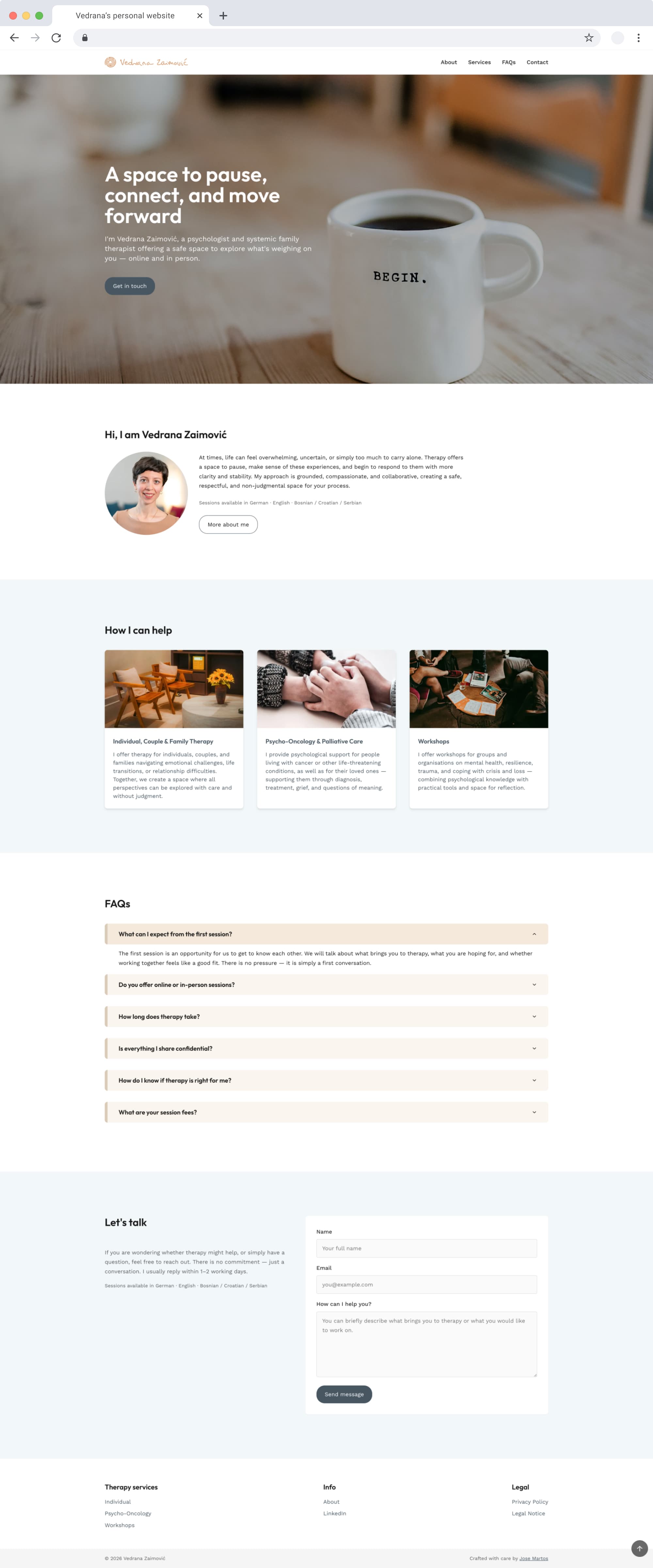
Takeaways
Designing something and then building it five years later is an unusual way to audit your own judgement. Most design decisions never get reviewed by the person who made them, with that much distance and a different job in between. Most of mine held. The ones that didn't (the typefaces, that contact form) failed for reasons I couldn't have seen in 2020.
The other thing: when the client lives with you and the words on the page are her actual practice, generic patterns stop being tempting. There's no abstract user to design for. There's one person, and she'll notice.